Our Website is 'Responsive'
In April 2014, over 25% of people who visited the Continuing Education website did so using a smartphone or a tablet device.
To accommodate this growing mobile audience we have recently upgraded our website to display information more effectively on small screens - using an approach known as 'responsive web design'.
Responsive web design (RWD) aims to provide an optimal viewing experience - easy reading and navigation with a minimum of resizing, panning, and scrolling - regardless of whether the website visitor is using a mobile phone, tablet, laptop or desktop computer.
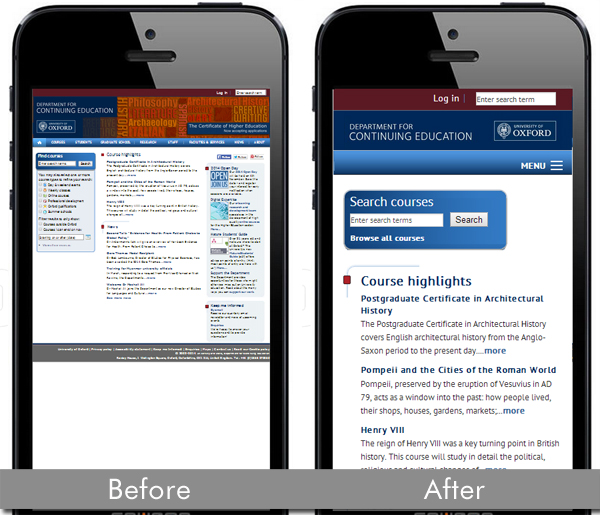
It has long been possible to know what device a visitor is using to view a website; responsive design rearranges and prioritises the content to display to best advantage on each size of screen. For mobile devices, the website's navigational menu is usually prominently indicated, but remains hidden and out of the way until needed. Text areas and images resize to display without horizontal scrolling.
Websites that are not responsively designed, on the other hand, display webpages in entirety, no matter what device is being used. On a smartphone, this means the pages show up in miniature, and users must them zoom in on or 'pinch' the screen content, scrolling vertically and horizontally, to display the text in a readable size.
RWD is a feature of the newly re-launched Oxford University homepage, which went live in April, and will be extended over the coming months to include Undergraduate and Postgraduate Admissions websites.
If you have an interest in responsive design, the Department is offering a course on the subject in October. See www.conted.ox.ac.uk/G400-124 for further details.
Published 21 July 2014